For employees Search

Typography

Here you can read everything about our fonts, also called typography.

The identity fountain

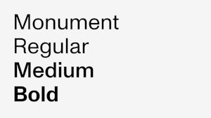
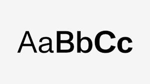
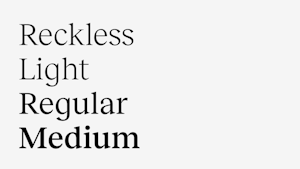
Monument and Reckless are the identity fonts for the Norwegian Academy of Music.

The fonts have been chosen for their distinctive qualities and the interaction quality between them- an essential visual tool for identity. Therefore, you must carefully follow the guidelines for how to use the fountain.

Monument

Monument Grotesk is our primary font.

Monument Grotesk is a sans serif font published by the Dinamo font publisher. Monument is a modern interpretation of the classic grotesque font. Monument is available in three variants (for our identity) – regular, medium and bold.

Reckless

Reckless is a serif font published by the font publisher Displaay. Reckless is inspired by old classics such as Plantin and Times New Roman. With its high x-height, it stands well with Monument, creating a distinctive expression for the Academy of Music.

Monument + Reckless

The combination of Monument and Reckless reflects the modern, innovative, traditional and classic. The interaction between the fonts gives us a rich and exciting typographic toolbox. This interaction is also one of identity's most important moves to create consistency and recognition over time.

The combination of Monument and Reckless allows us to highlight, emphasize and divide our message.

Typography in use

Combine Monument and Reckless to create a richer typographic expression. Mixing different paragraph templates creates a playful and rhythmic typographic expression that reflects our core business.

Example of use

Fallback fonts

Preferably, we shall use Monument and Reckless in all communications. When that is impossible, such as in presentations or the like, we have defined Arial and Times New Roman as fallback fonts. Arial and Times New Roman are system fonts with most of today's operating systems.

Do you have questions about our visual identity?