For employees Search

Logo

Here you can read everything about our logo.

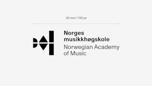
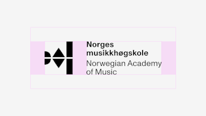
The logo is our most explicit and most important identifier. The logo consists of a symbol and a name feature. The elements must fit together and not be used in any other way than the variants provided by the communications section. The logo must only be used proportionately. Below you will find the guidelines for how to use it. These guidelines apply to placement, scaling, use of colour, incorrect use of logos, etc.

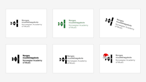
Cases where the logo can be used differently

The management at NMH, through the head of communications, can decide whether specific campaigns and issues can deviate from the visual profile regarding colour choice and design. Examples of this are replacing logo elements to mark NMH's anniversary or using rainbow colours in NMH's logo during Pride, which are then used for a limited period on websites, social media or marketing material.

Primary logo

The primary logo is positive and 100 % black. It is a locked-in setup and must not be used in any other way than defined in these guidelines.

Negative logo

When the logo is to be reproduced on a background where the black logo does not contrast well enough, we use a white logo. It can be on a coloured background or a photo. The logo must continuously be assessed against the background so that we get enough contrast and visibility.

Logo for the research centres

Separate logos have been developed for our various research centres. You can download both Norwegian and English versions of each logo.

Logo for social media

We use our symbol on social media. It requires a middle position when placed on a smaller surface. Download your files for social media such as Facebook, Instagram and Twitter here.

Placement of logo

It is crucial that there is an apparent sender in all communication from the College of Music, and our logo must always be on all surfaces. As far as the format allows, the logo should be placed at the bottom right or left, within our regulations for placement (see section "Safe distance"). In narrow formats, you must centre the logo.

Minimum size

To ensure the logo is readable, it must be used at the specified minimum size.

Print

The minimum size for print is width: 30 mm

Digitally

The minimum screen size is width: 135 px

Clear space

For the logo to function optimally, it must have enough air around it, both for digital use and printed matter. You cannot place other items within this distance. The minimum length is related to the distance between the symbol and name feature - see the illustration below.

Incorrect use

The logo must not be stretched, changed, adjusted or reproduced as in the examples below. This does not apply to campaigns where the management decides that the logo should be used differently. See top of page.

Interaction between the Academy of Music and the research centres

When the Academy of Music stands with a research centre, the NMH logo must appear first.

Do you have questions about our visual identity?